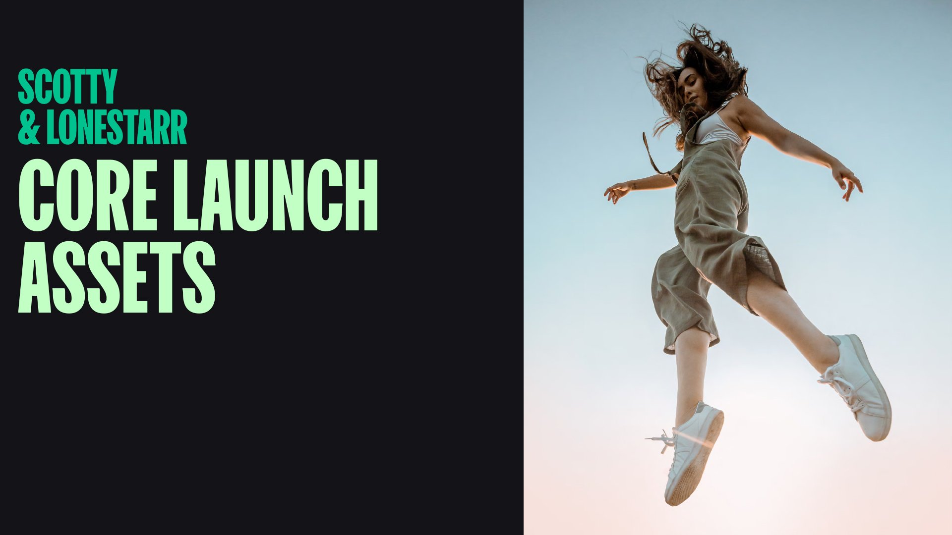
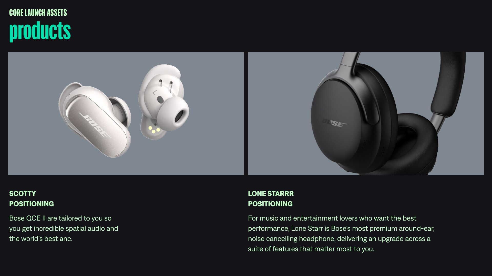
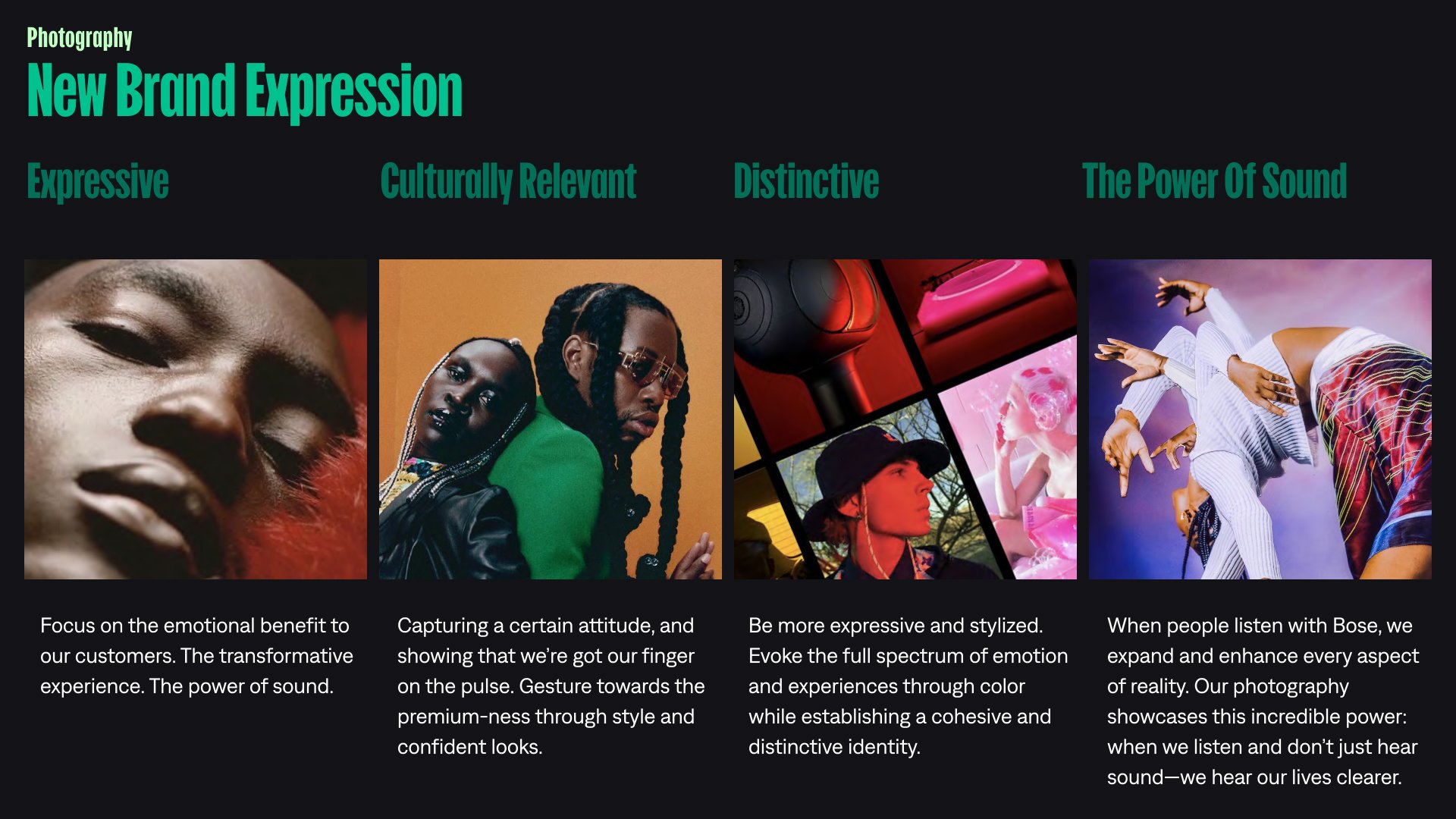
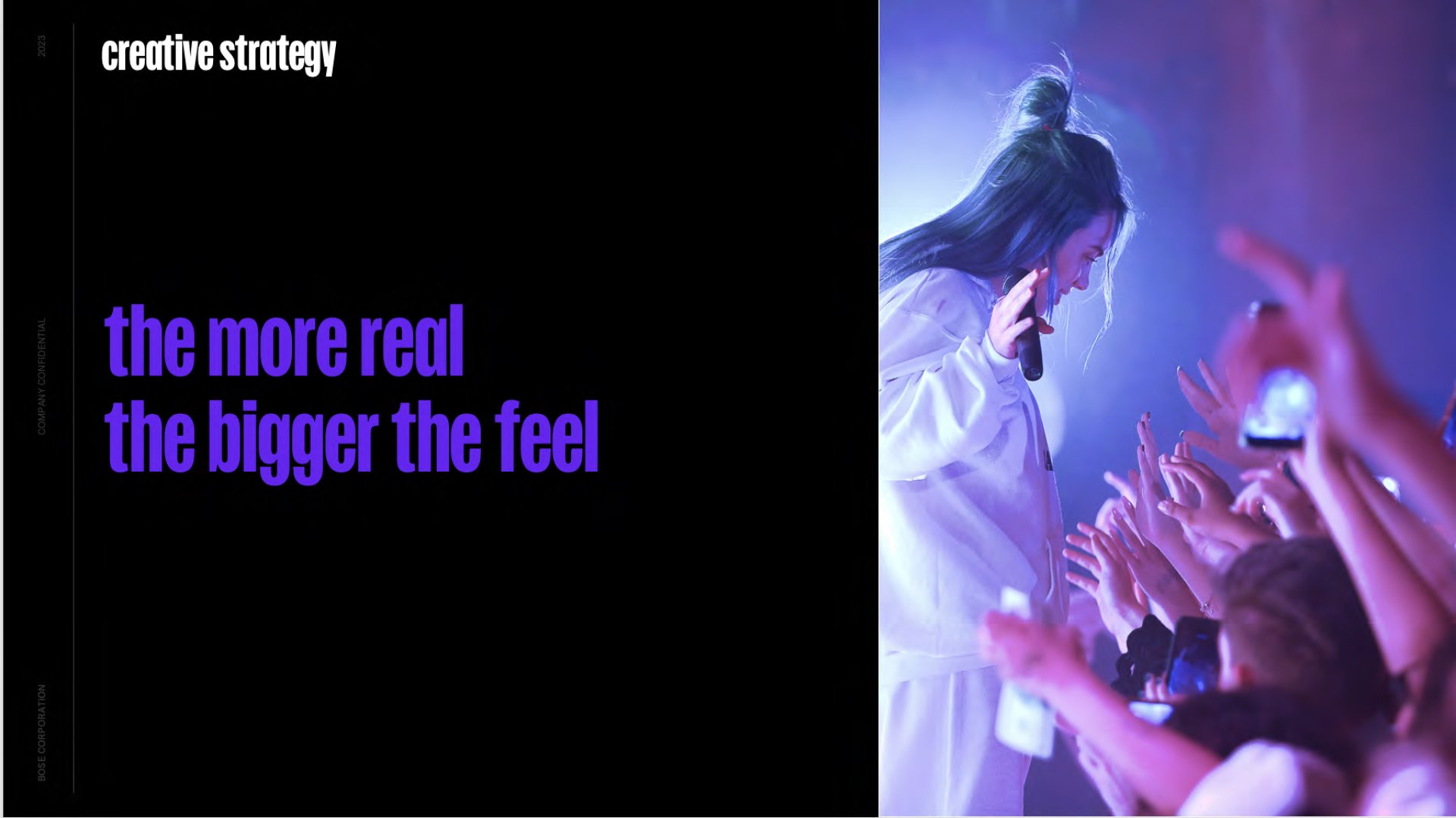
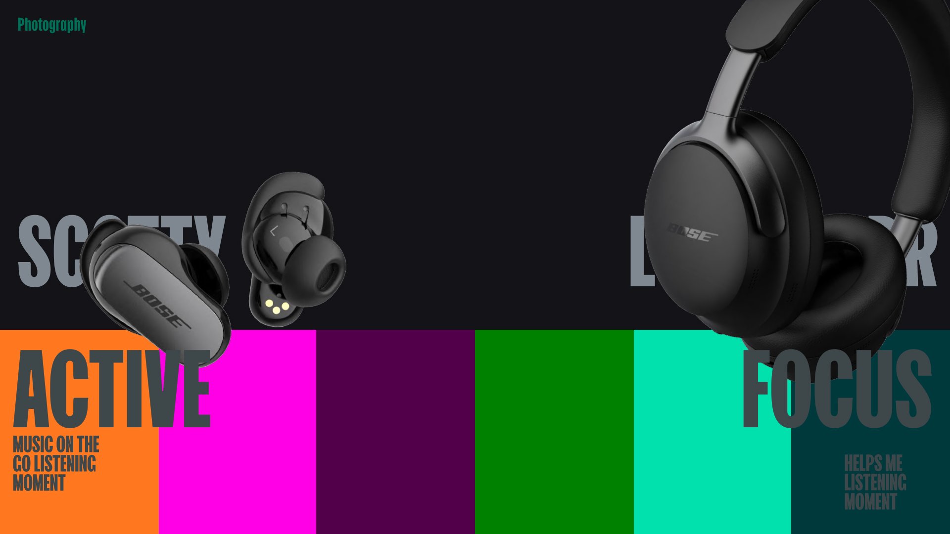
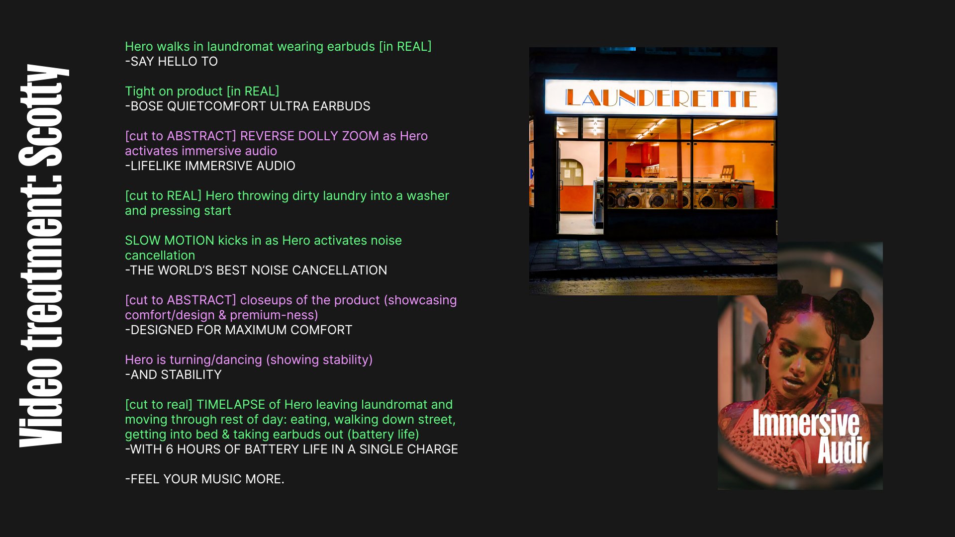
Headphone Brand Launch
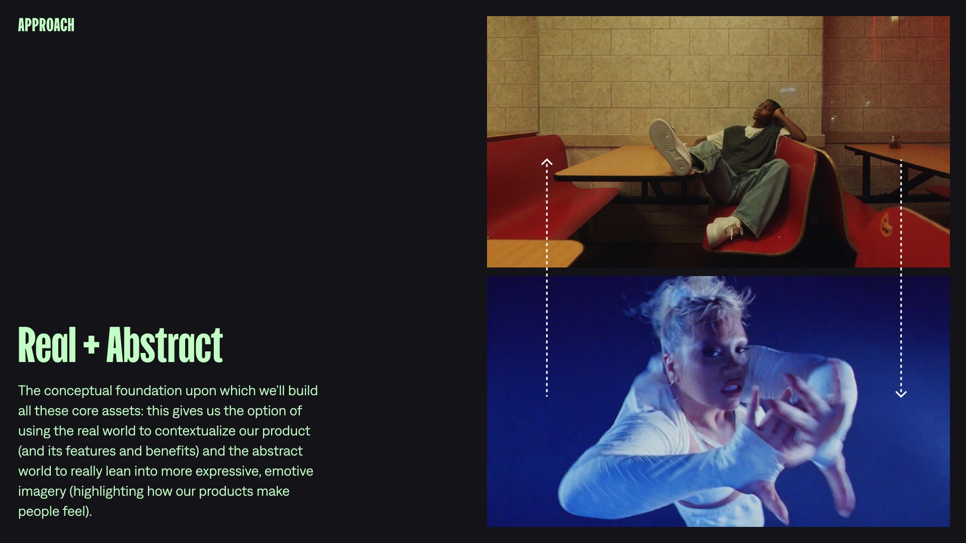
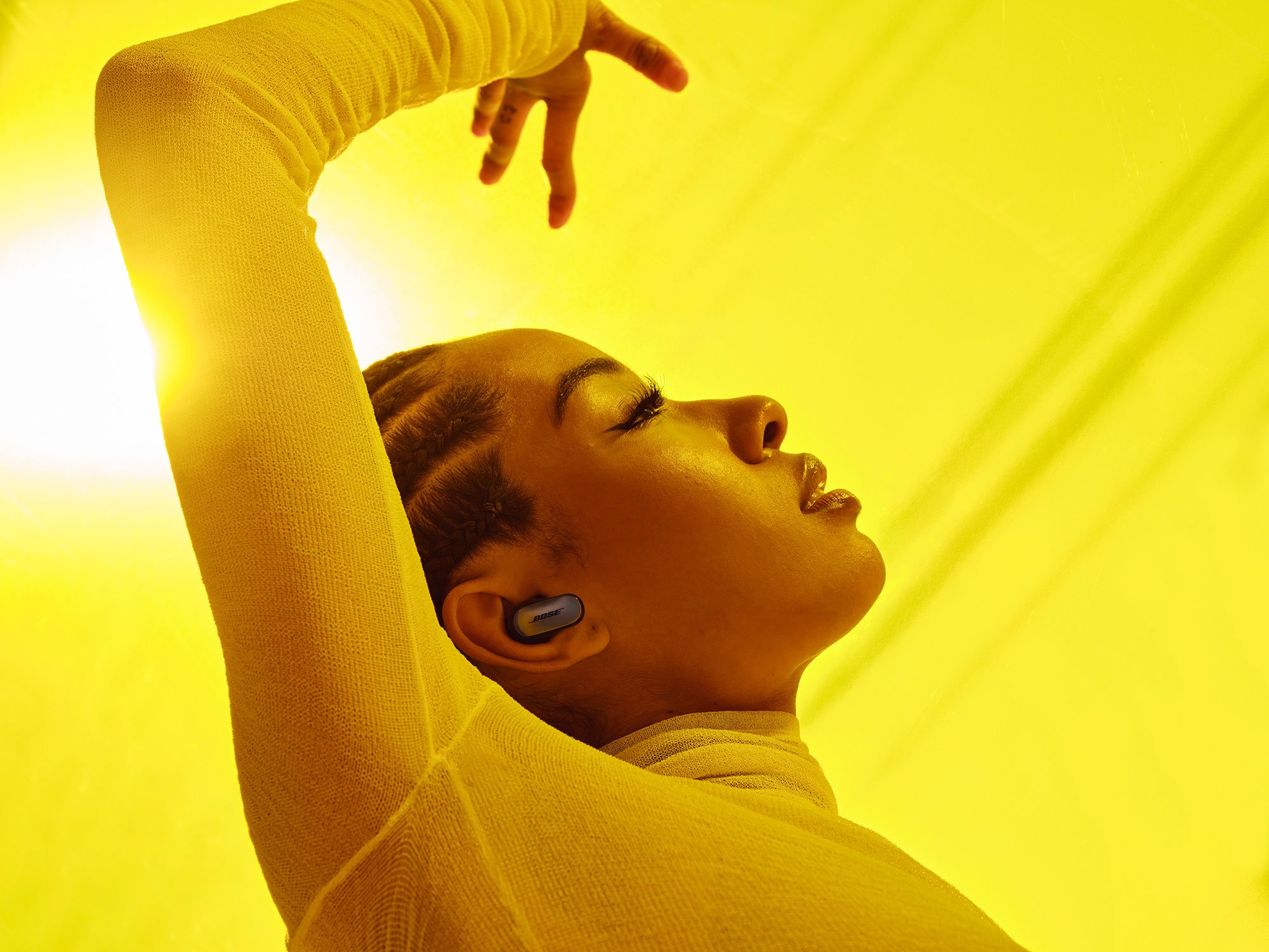
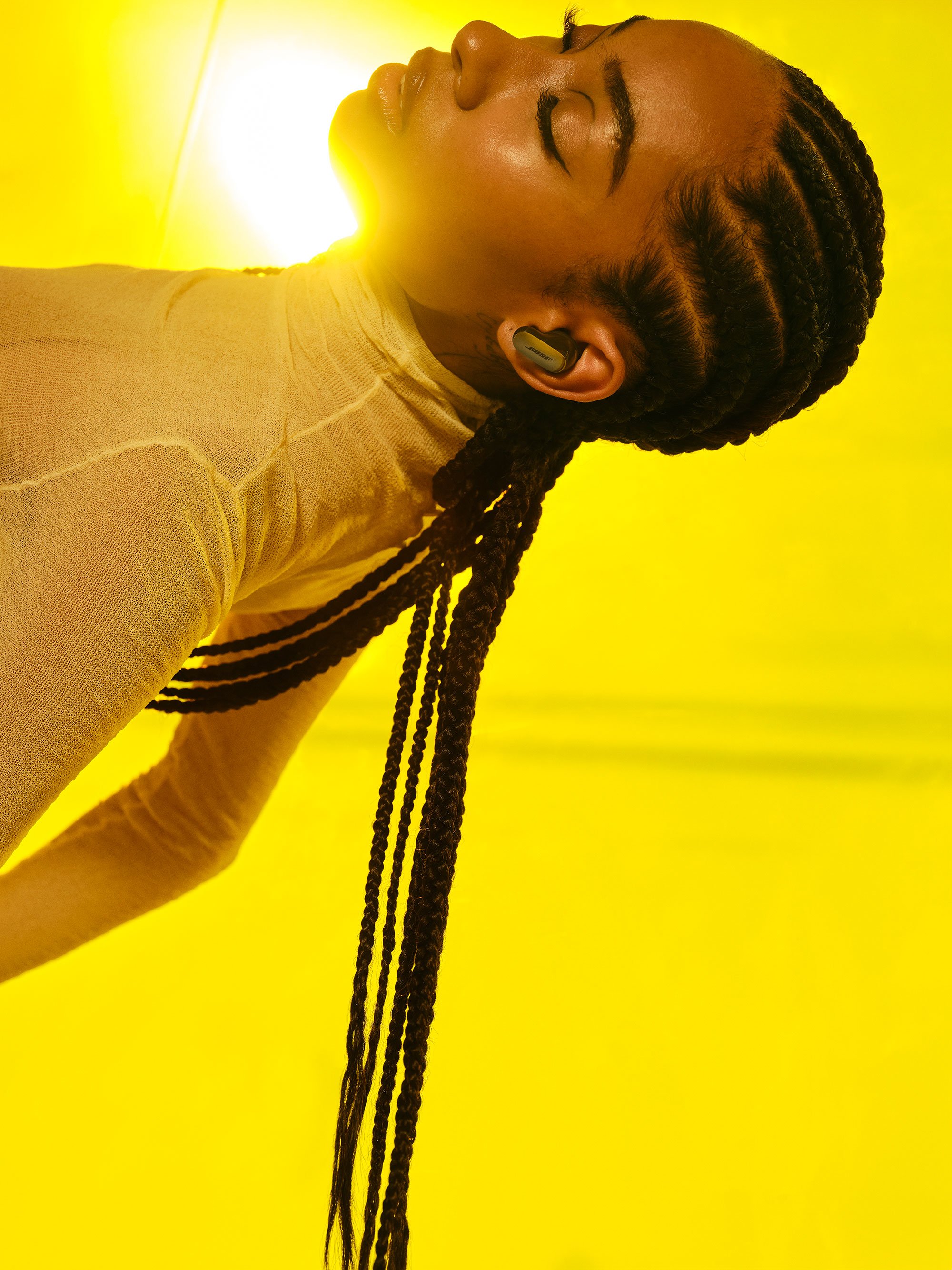
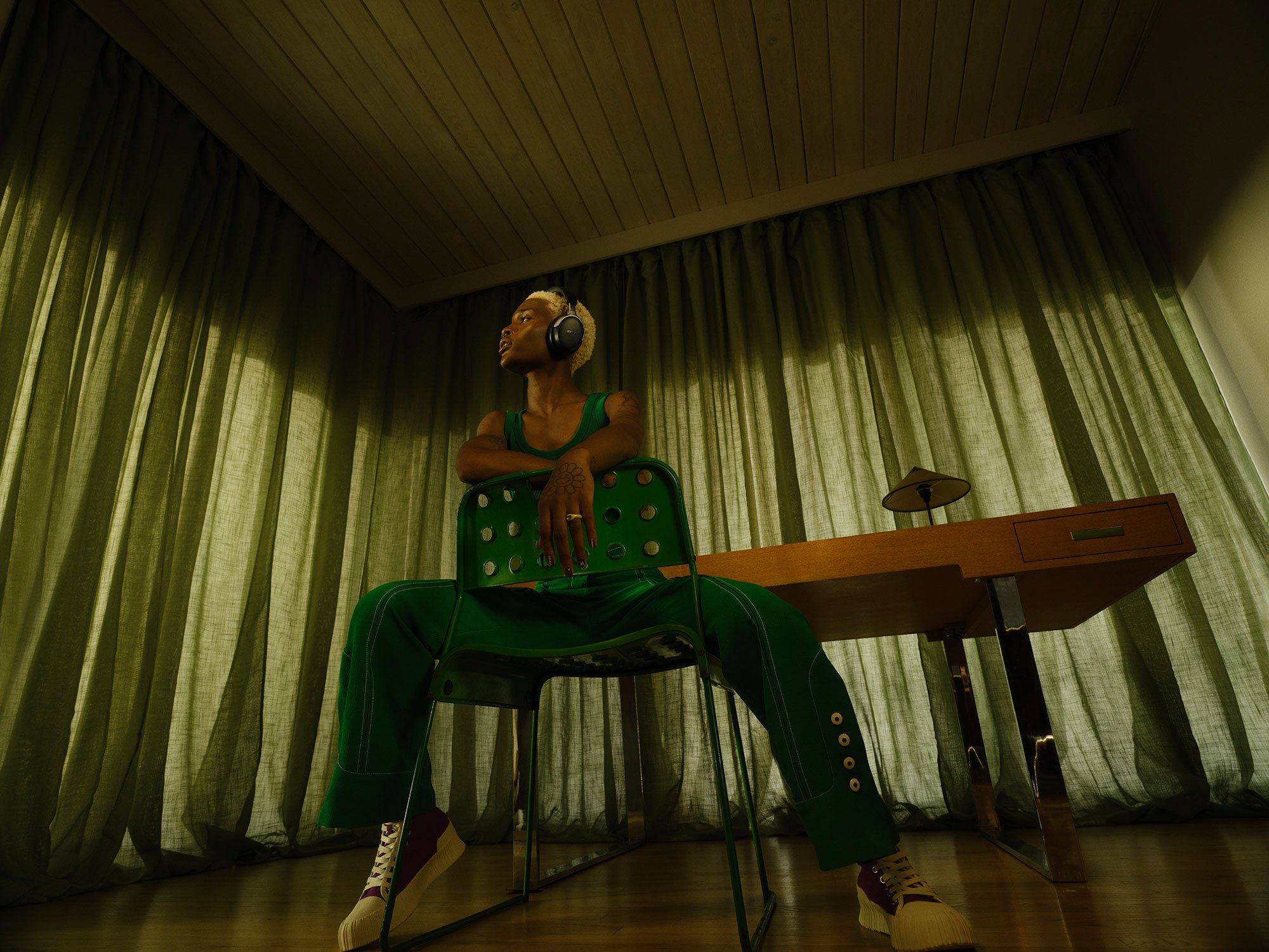
This was a combined video and stills shoot for two new headphones alongside the launch of a brand re-design. Not only would this campaign launch two flagship products but it would also be the introduction to a new chapter of the Bose brand. Our aim was to capture an expressive, fashion-forward, and culturally relevant aesthetic that was at the core of the new brand. The campaign was centered around the key thought: “The more real, the bigger the feel”. This key thought explores immersive audio experiences that are so lifelike that they bring out even bigger feelings from those experiencing them. The concept explores both the "real" and "abstract” sides of this experience, allowing for the representation of practical use cases while also setting the stage for the expressive states of emotion. Leveraging the brand's new color palette, our aim was to vividly capture these moments through the use of color and enhanced lighting.
Art Direction / Video / Photography
ONLINE VIDEO
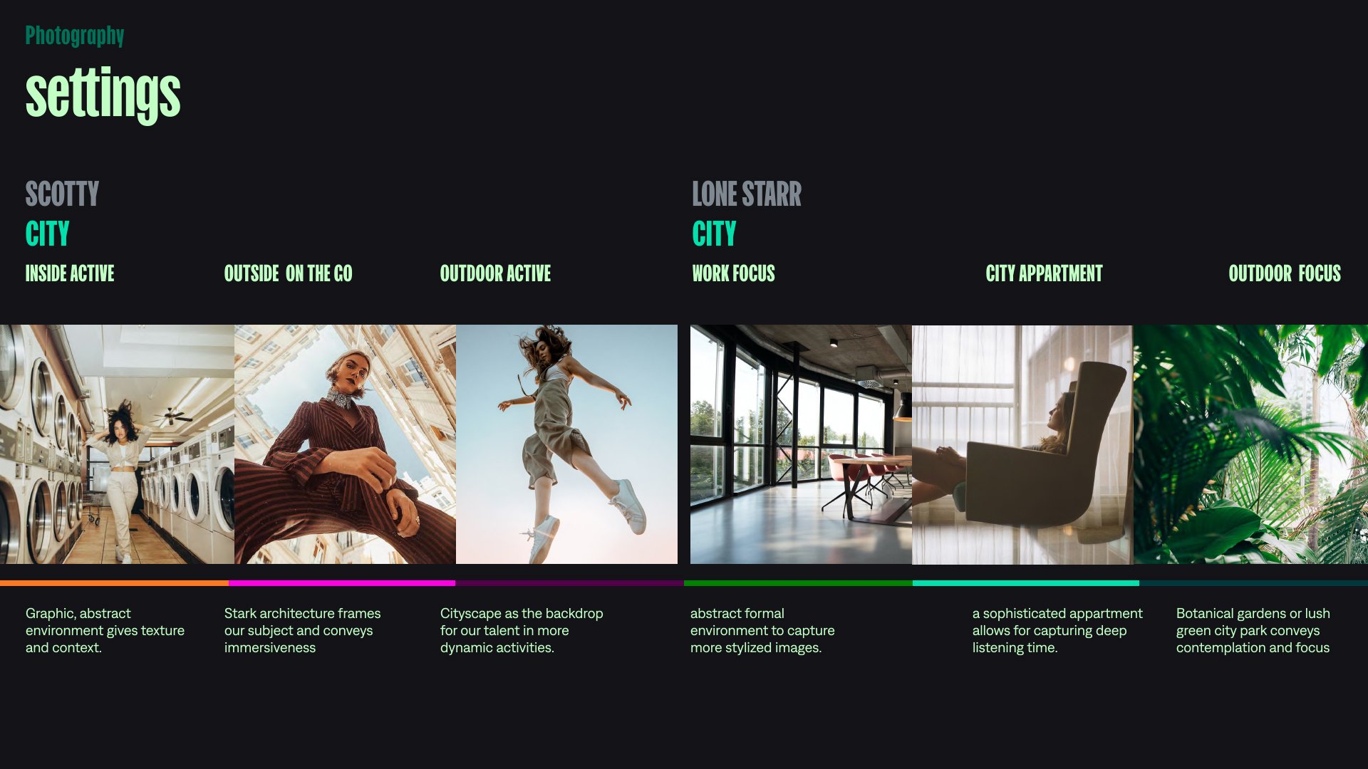
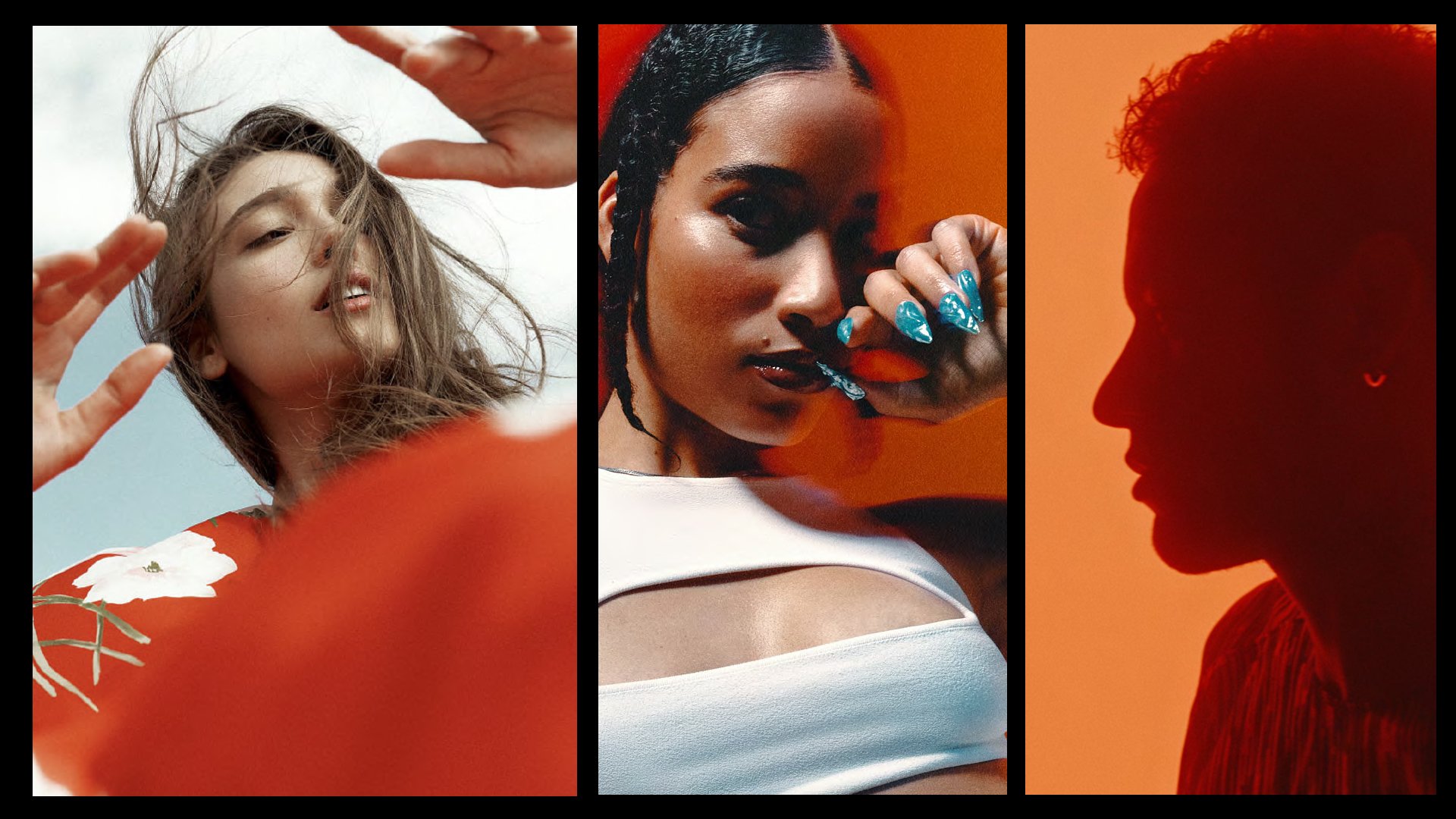
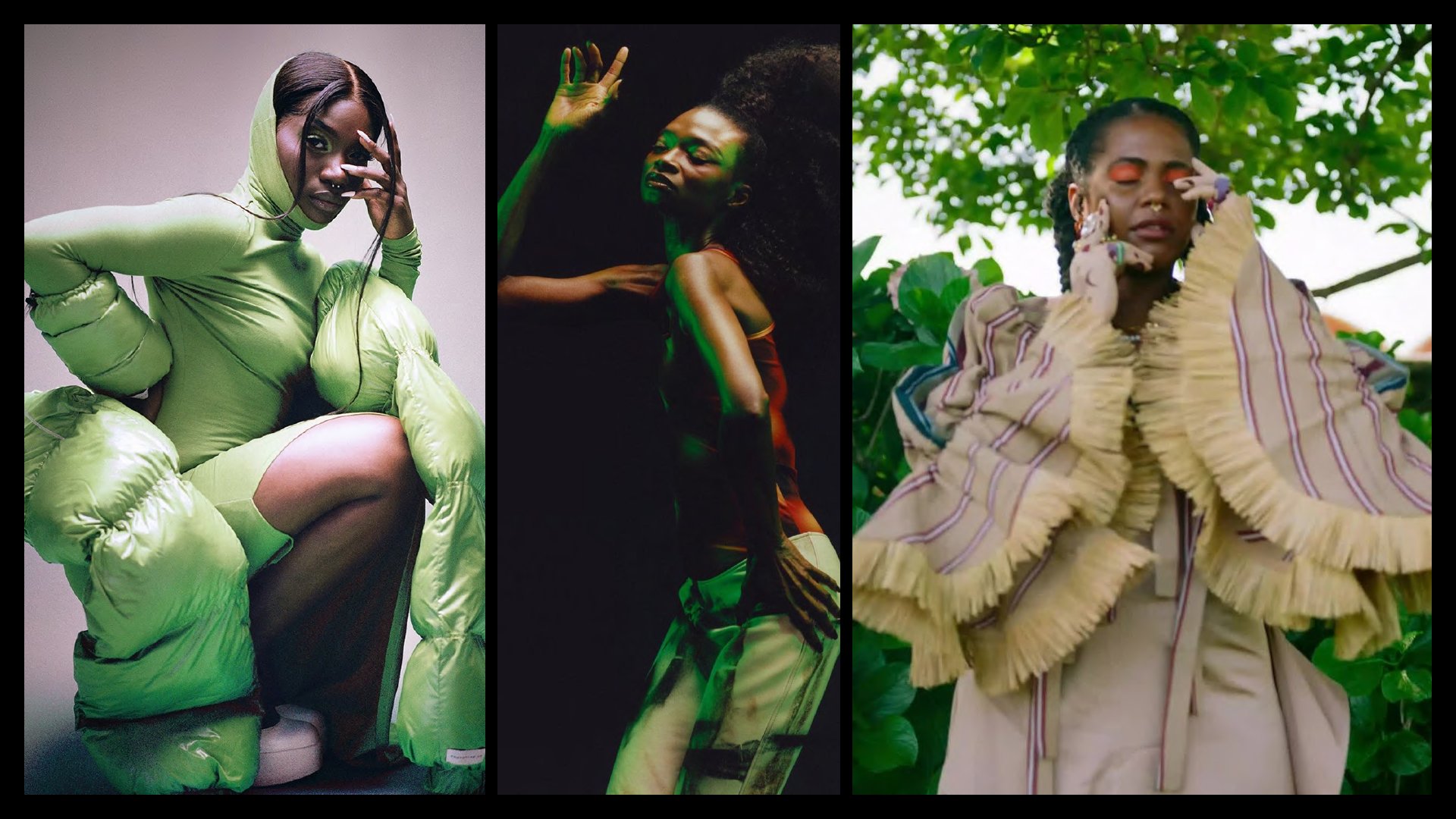
This 2-day shoot featured two products, each captured on separate days. The concept came to life by pairing real practical use cases with more abstract settings driven by emotional states of being. We especially took great care in capturing the abstract worlds, utilizing body movement of the talent and color to represent their emotional worlds. Dynamic camera moves mirrored expressive on-screen dance and also highlighted product features throughout. The videos were paired with tracks that complimented their respective moods and added sound effects that punctuated key moments. The sounds, music and color all worked together to differentiate each product, with earbuds taking on a more active warmth, while the headphones took on a cooler focused vibe.
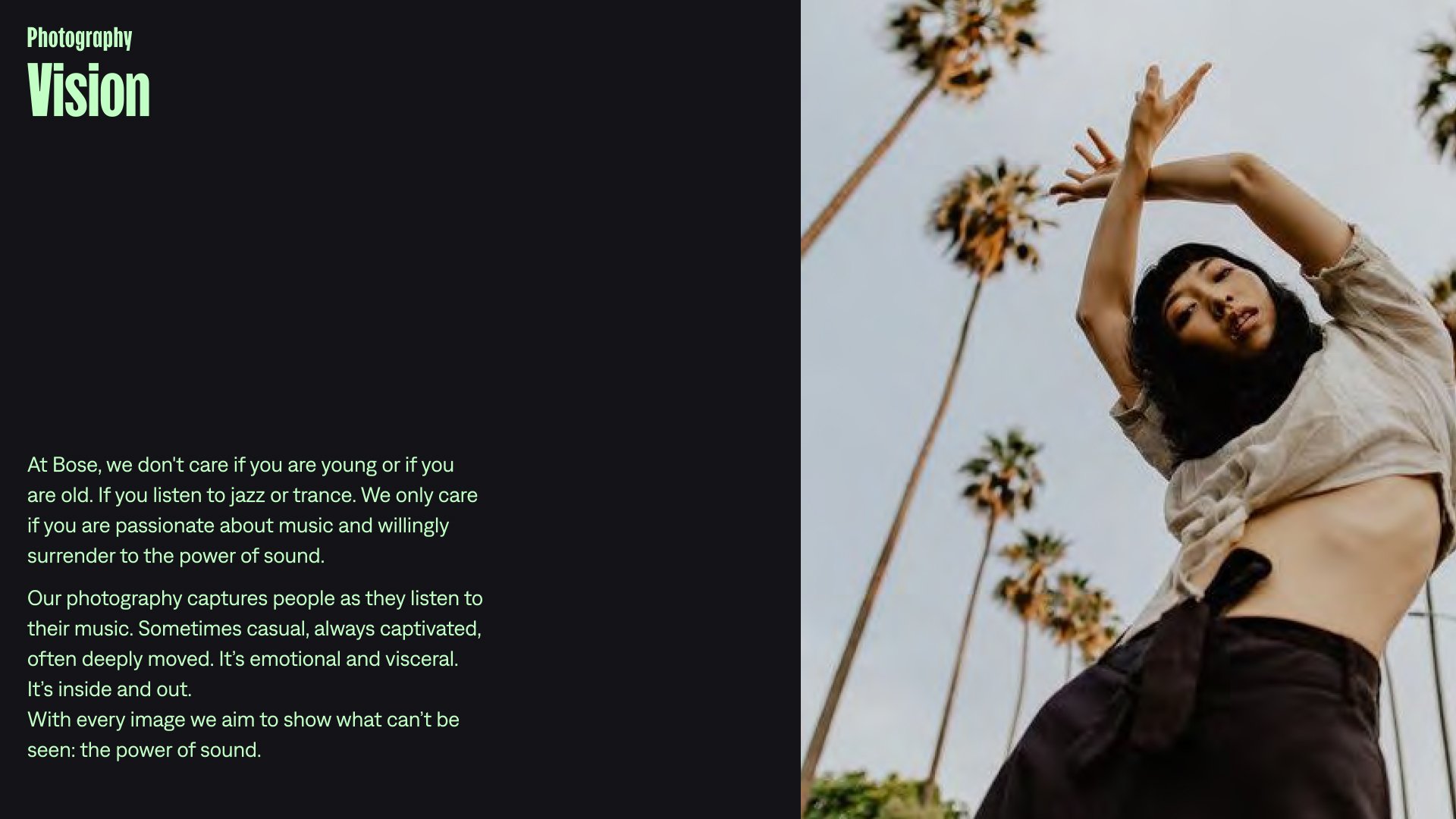
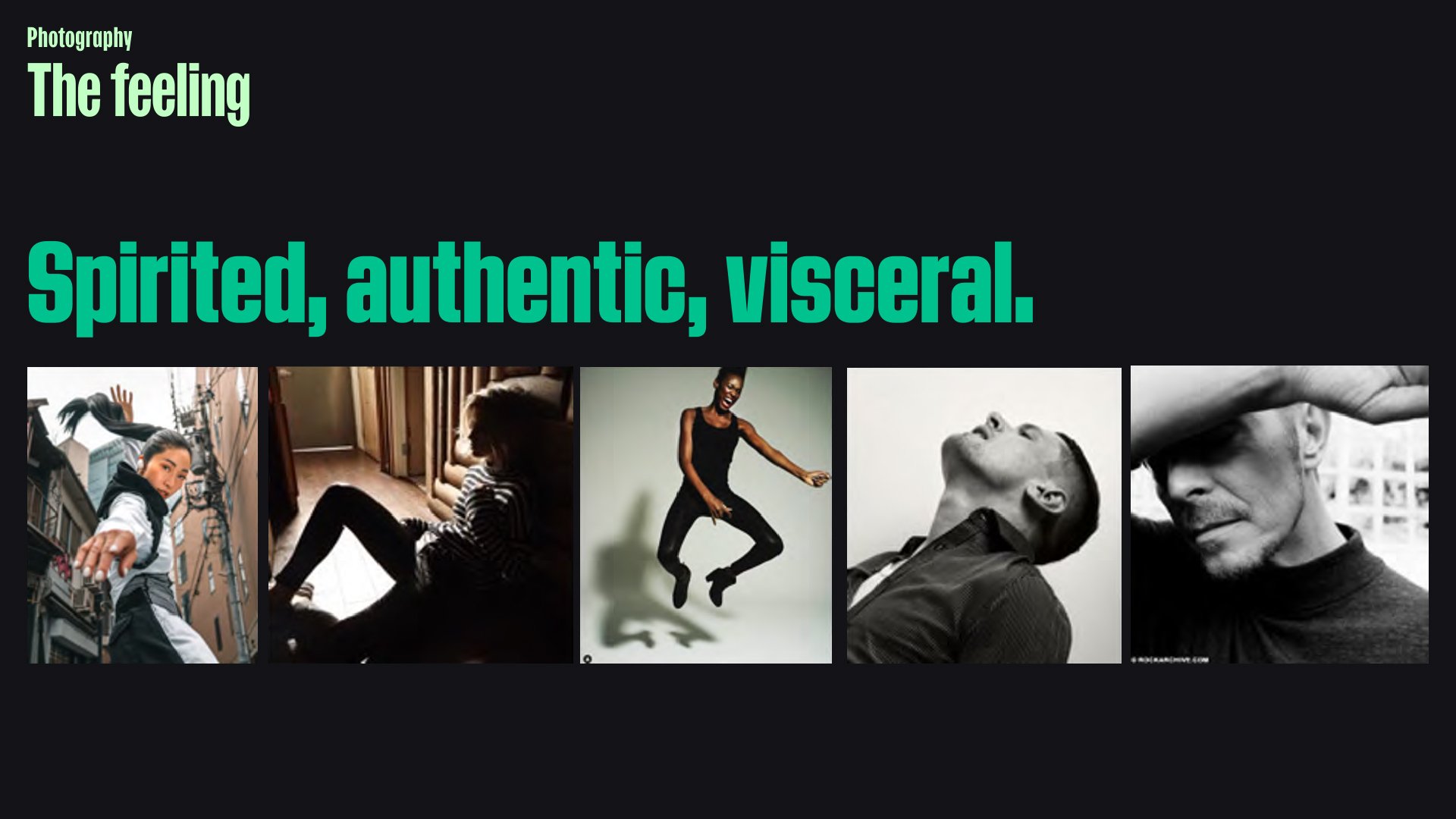
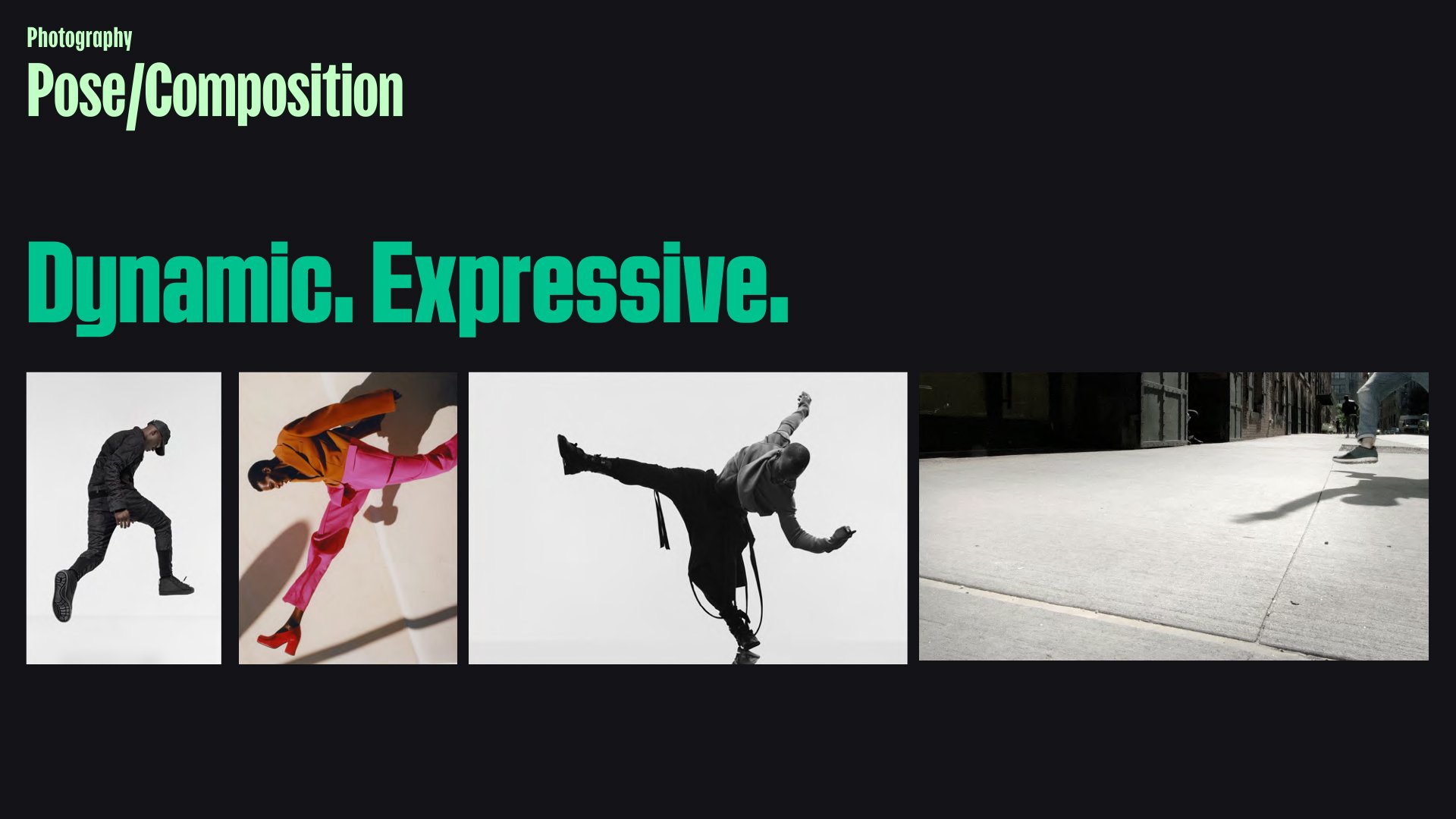
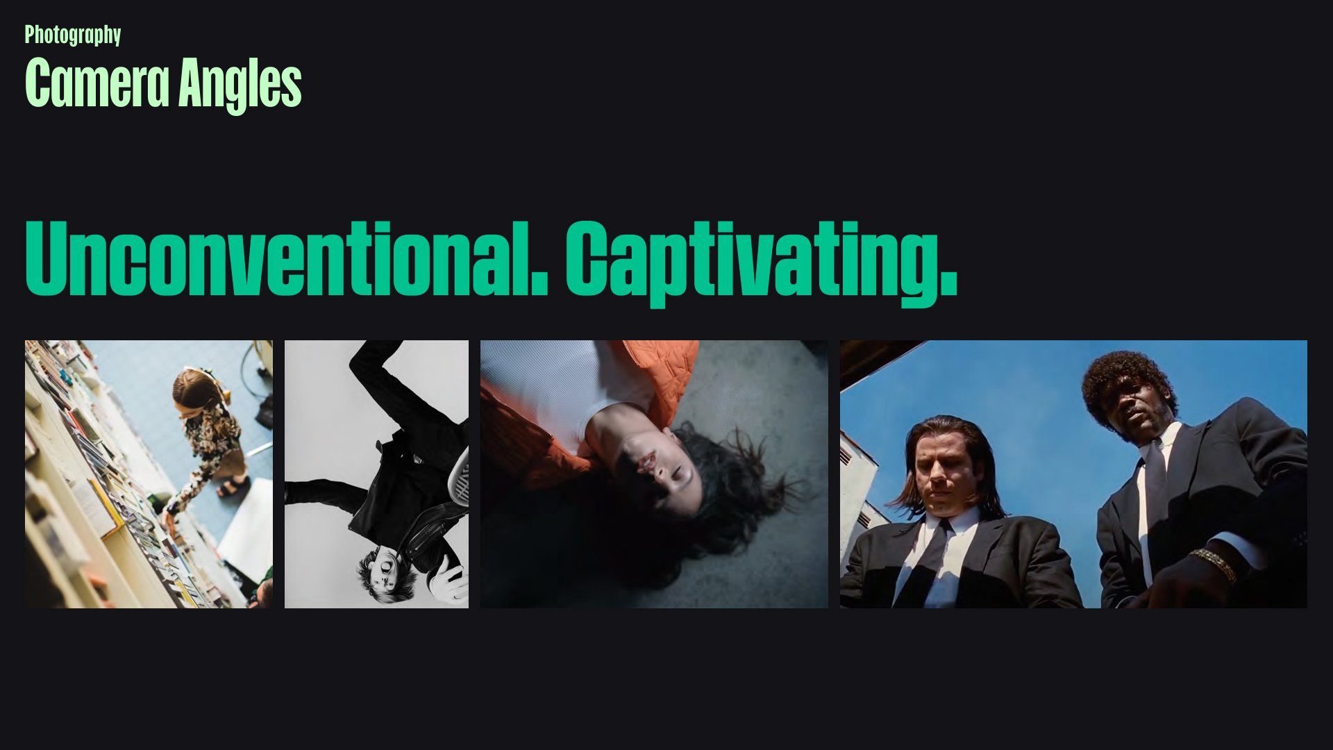
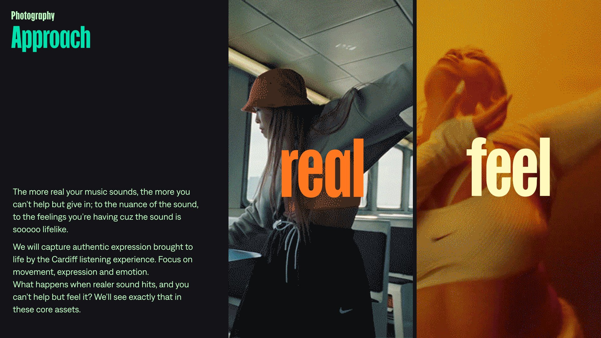
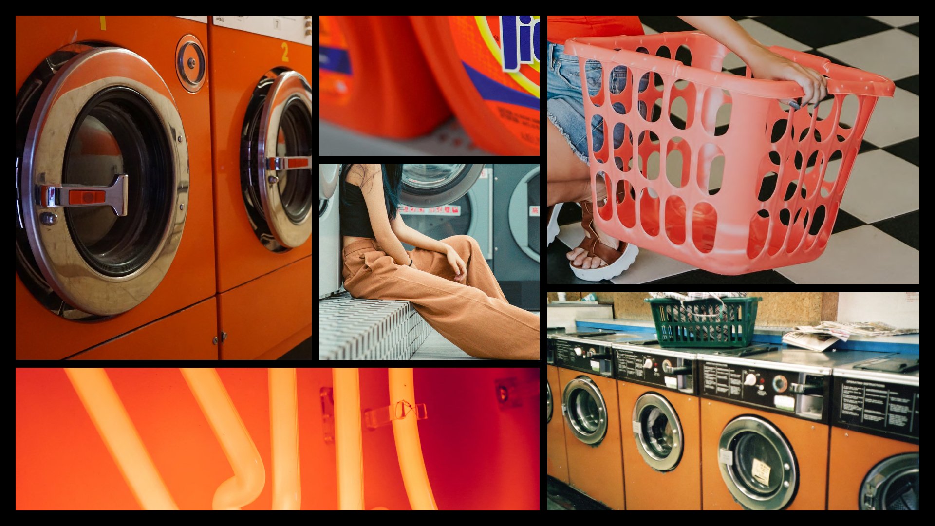
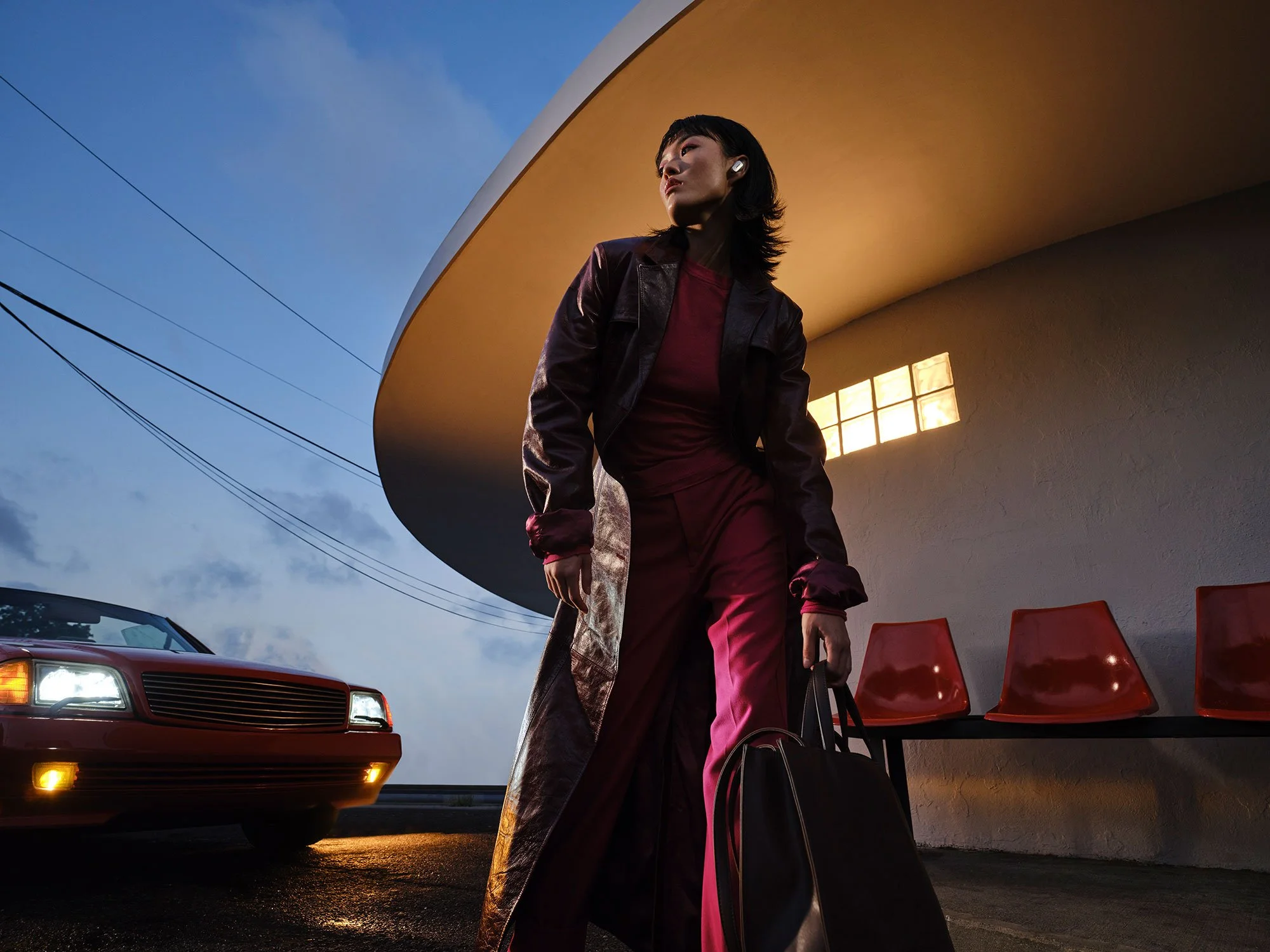
PHOTOGRAPHY
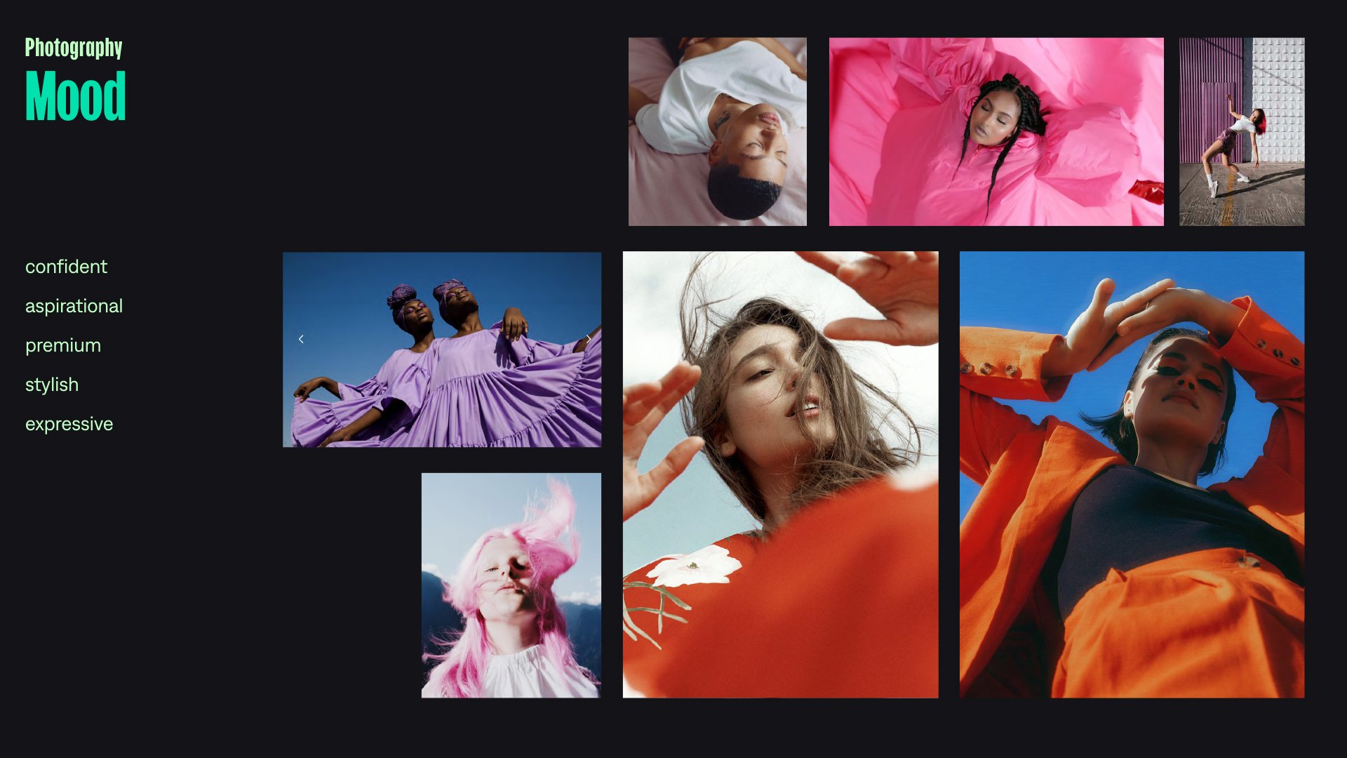
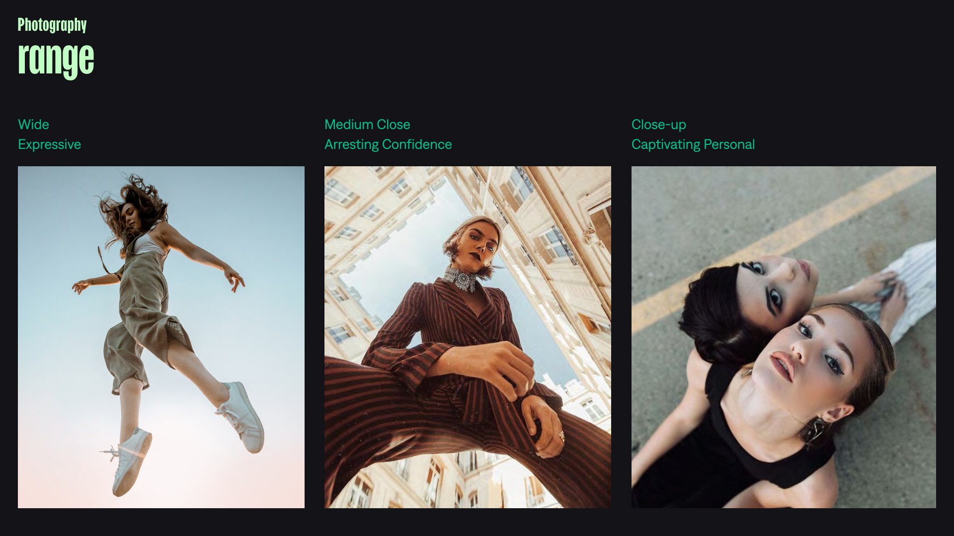
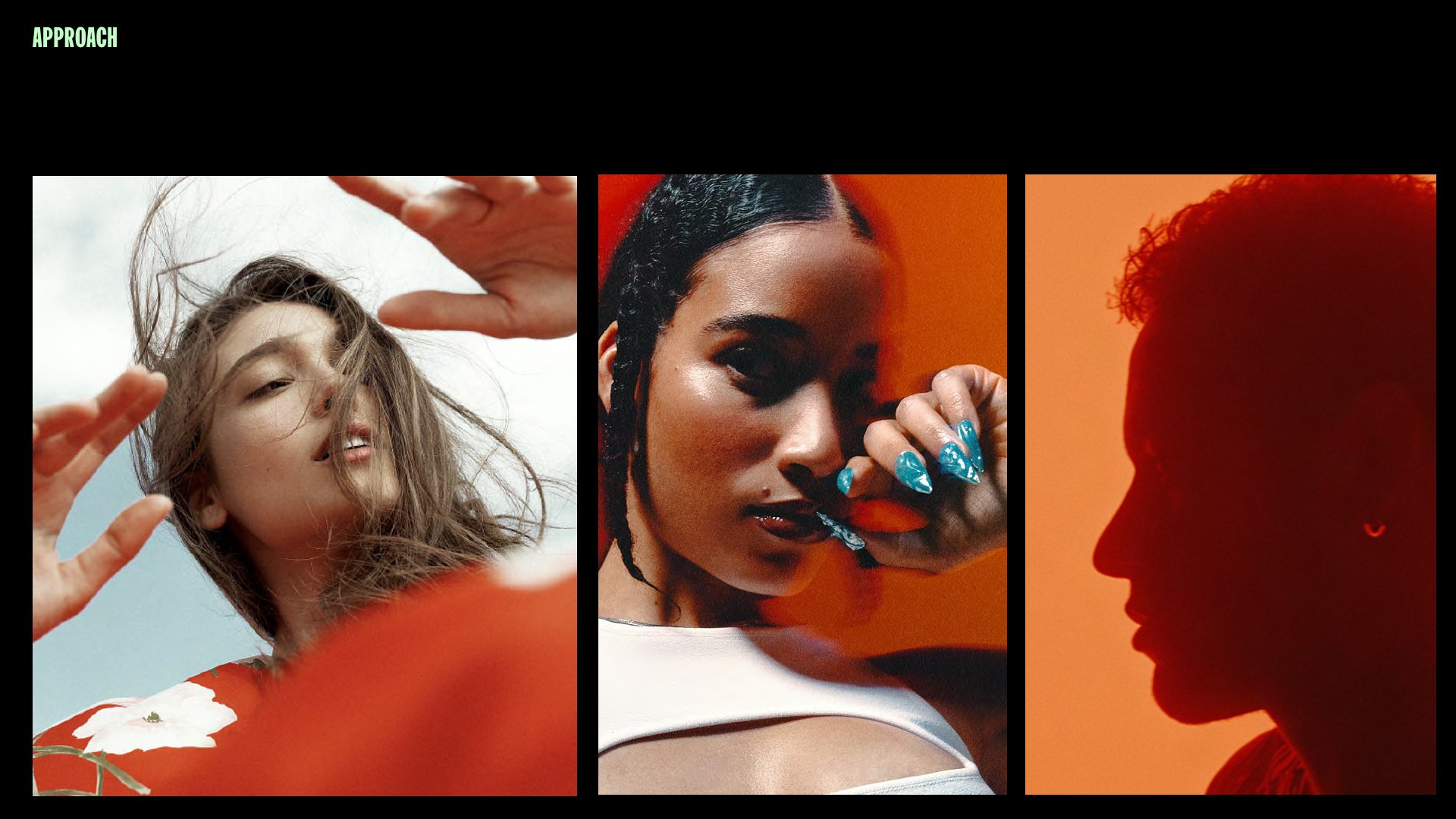
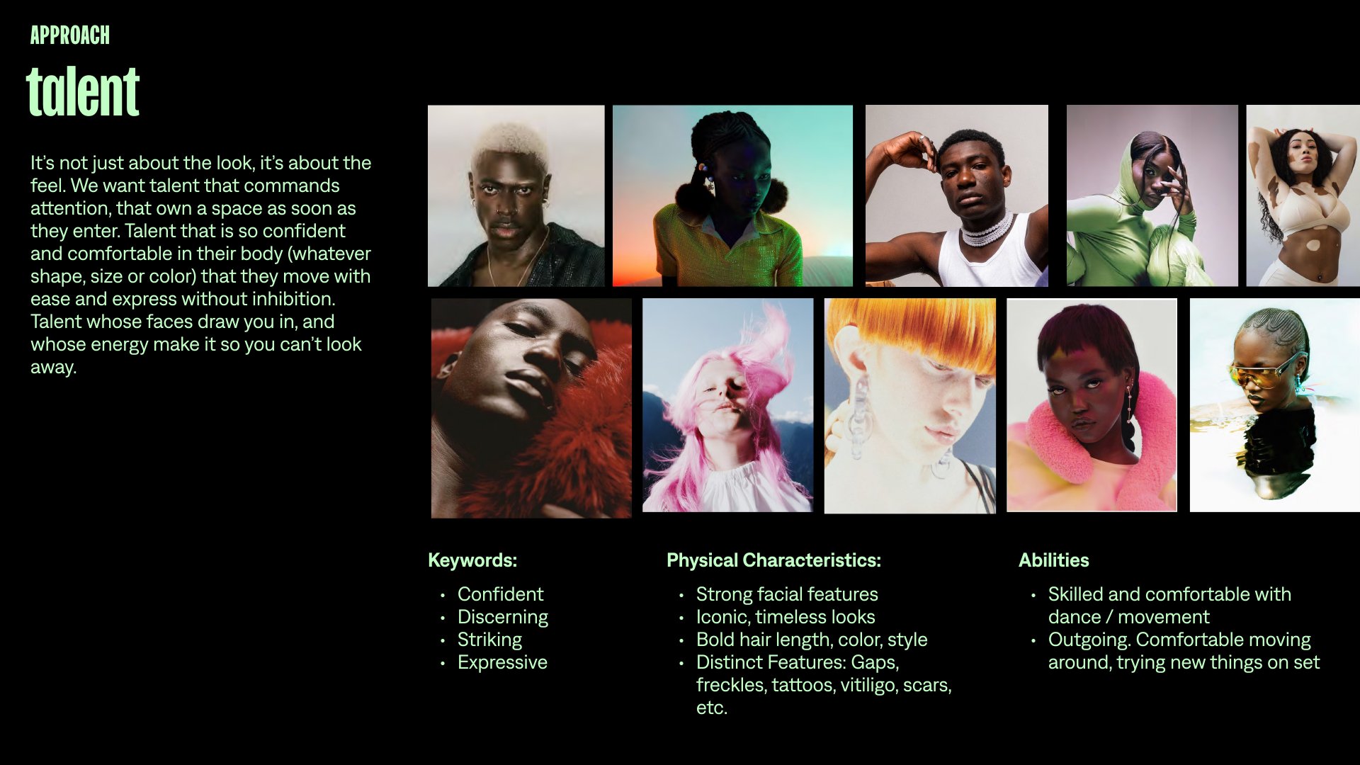
For stills we aligned the color palette for each scenario with our overall cool and warm approach. We also made sure to find talent that could not only dance but had great control over their facial expressions and body. This was very important in stills as we aimed to capture those expressive moments in detail. We also made use of color blocking in their wardrobe to solidify our color strategy and emphasize the bold look. We took great care in color correction so that both the talent and product could shine; emphasizing the lighting on set, while still accurately representing the product.


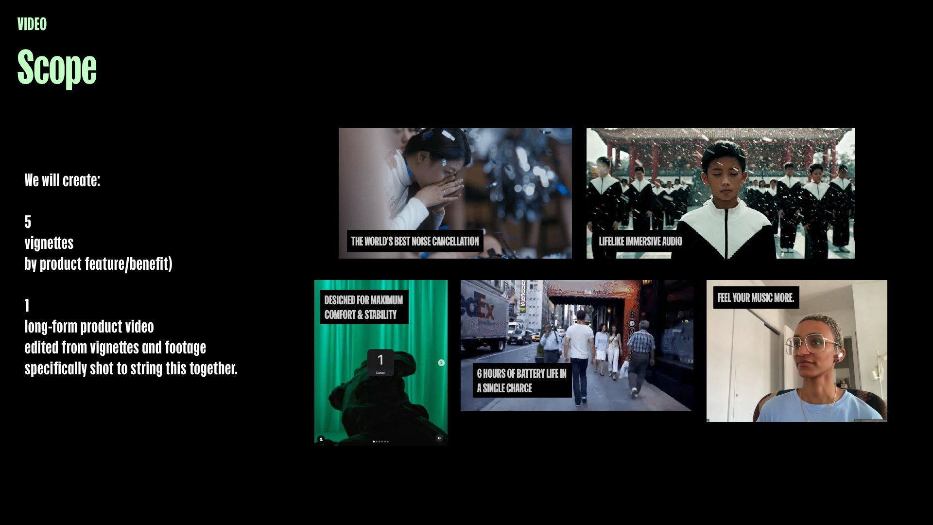
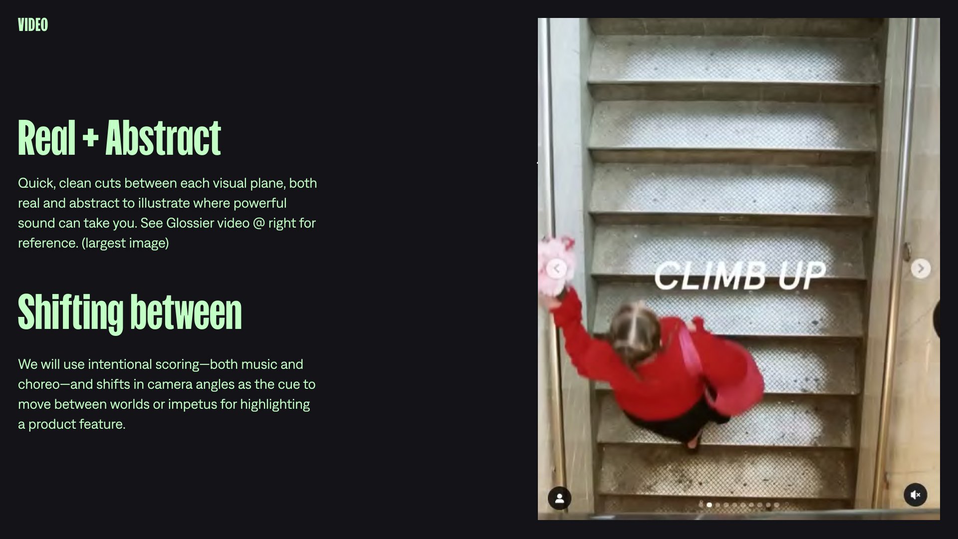
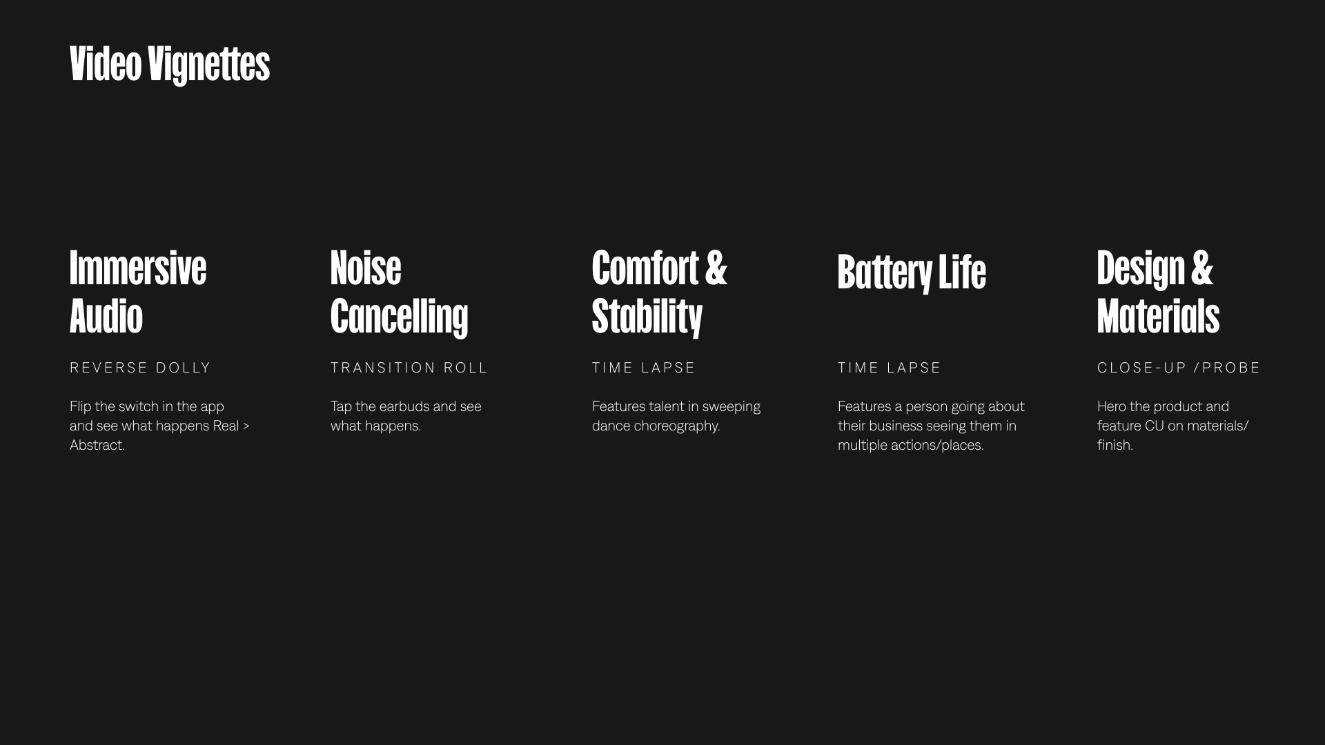
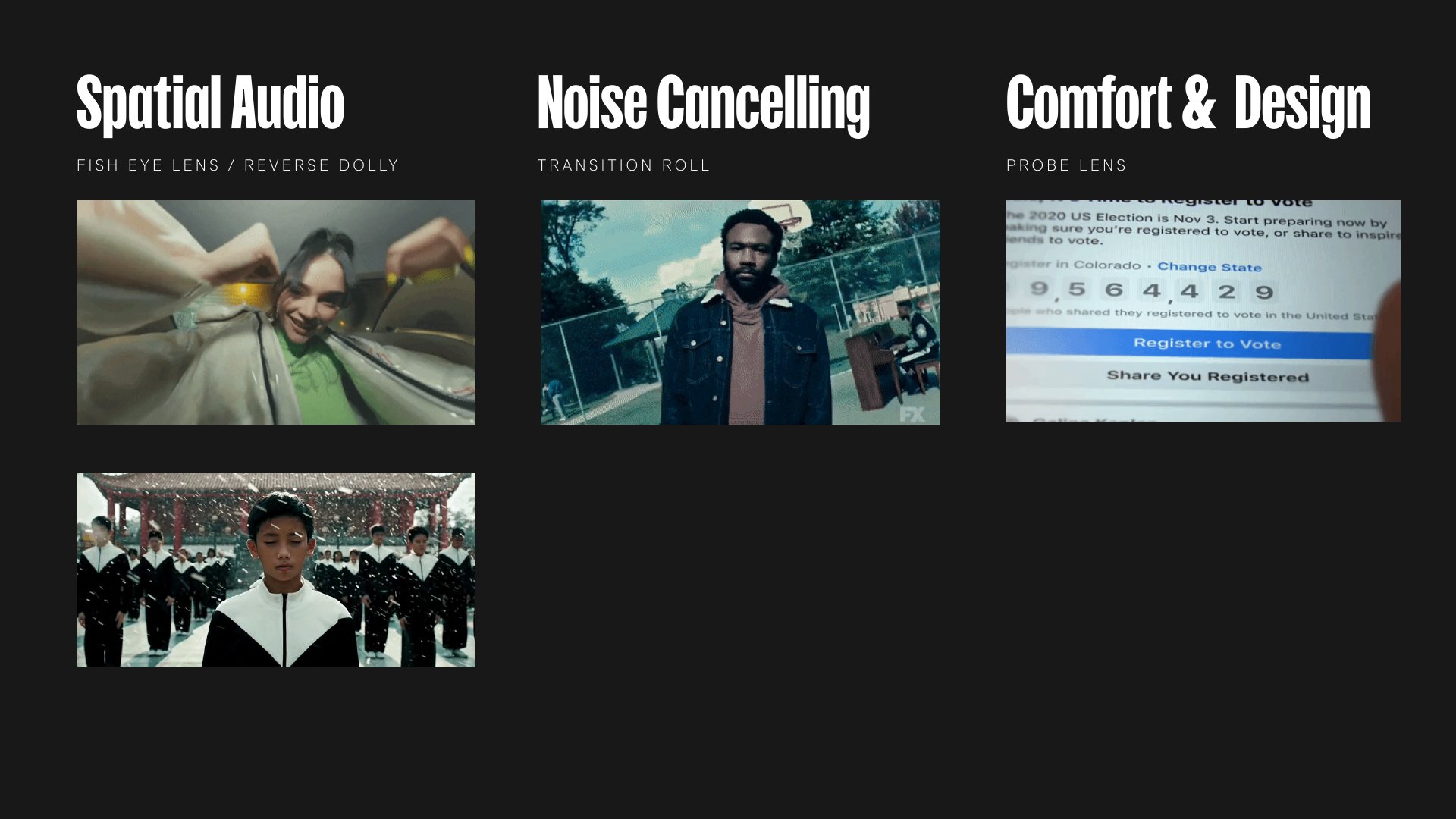
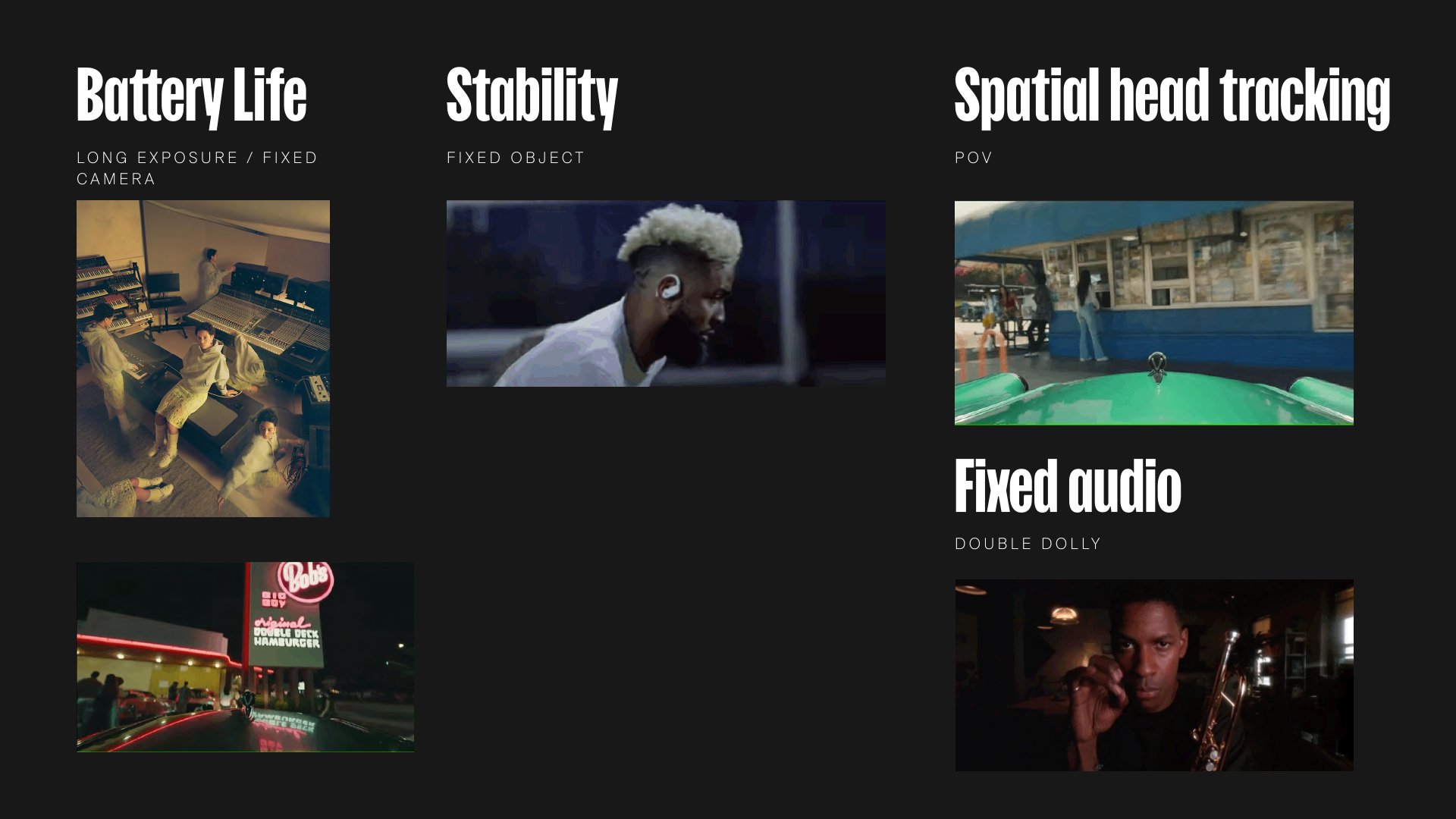
Vignettes
We had specific sequences shot to highlight the most important features of the product. These vignettes were looping videos that would be on product pages and other channels. These videos would help bring these features to life for the consumer lower in the customer journey.
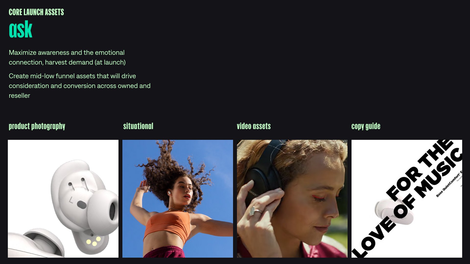
expressive imagery
Along with the video and still assets, we also created product renders that aimed to mirror the expressive nature of the campaign.


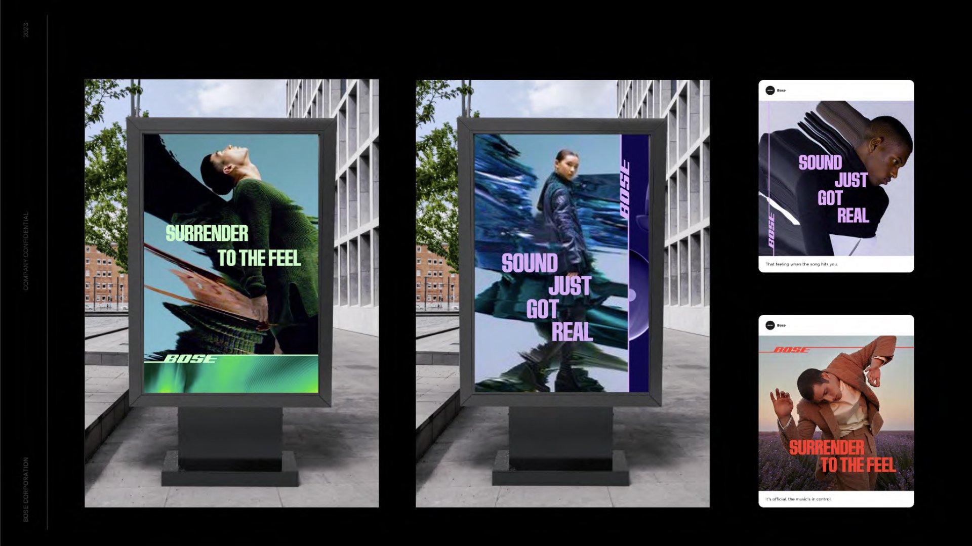
dIsplay ads & Site Experience


concept Boards
These were the boards we used to sell the overall concept internally and what we shared with directors and production to bring all of our ideas to life.
Copywriter: Emma Bracey / Creative Director: Gijs Winkel